 |
| The Duke and Duchess of Urbino, Piero Della Francesca, [1416-1492] |

Monday, February 28, 2011
The Duke and Duchess Come Home
The framer called yesterday, "The Duke and Duchess are ready". We had bought a postcard of The Duke and Duchess of Urbino when we were in Florence last fall and finally we had it framed. The first time I saw it, it stopped me in my tracks and this time was no different. This double portrait stands on a pedestal in the middle of the gallery at eye level and the light and the remote, almost other worldliness of the sitters makes it remarkably powerful. In some ways a deceptively simple work, it always manages to elude one. They stare at each other through time while the back of the work is painted with a allegory depicting their triumphal chariots. She is enthroned amid the virtues of Faith, Hope and Charity while he sits with the virtues Justice, Wisdom, Valour and Moderation. Must saw they look very fine in our kitchen and we have taken to calling ourselves the Duke and Duchess of Sutton Junction.
Saturday, February 26, 2011
The Salt Galaxies
galaxy |ˈgaləksē|
noun ( pl. -axies)
a system of millions or billions of stars, together with gas and dust, held together by gravitational attraction.
Looking at the salt stains on the car the other day all I could see were echos of the milky way, and as I put the images into the grid I still couldn't decide which I liked more. So here are both and I will leave it up to you to decide.
 |
| Salt Galaxy 1 |
 |
| Salt Galaxy 2 |
Thursday, February 24, 2011
Sea Holly
A friend brought these over yesterday and what a treat. Definitely one of my favorite flowers and I have never seen them at a florist. The color of the leaves is an iridescent purple lavender with the most amazing arrangement of spikes on the leaves. I grow a variety in the garden, a tall stately plant, some call an architectural plant, which give them a certain gravitas. The whole plant is edible and although I have never tried it the young shoots are sometimes grown with out light and eaten like asparagus.
 |
| Sea Holly |
Tuesday, February 22, 2011
Getting There
A short while ago I showed you the idea for a book I was working on, and how disappointed I was with the results. I hate giving up on an idea so it was time for a big re-think and behold a solution became clearer. Not enough white space. The images are very subtle in their colouring and needed white space about them, Taking the text of the image helped to, as did deciding to put the text on its' own page, giving it a lot of space and playing with the kerning. Building the book was really fun. I printed the pages in spreads of 4, trimmed them, glued them and folded them into a 400 in. long accordion, made the end plates, [don't know if that is the correct word] glued all together and voila, the latest incarnation.
 |
| Why I Paint, latest incarnation |
Sunday, February 20, 2011
More On The Overlooked
We had spring on Friday, one short very sweet day. We were in Montreal picking up J.B.'s panel for the next painting when I found these intriguing patterns of salt along the edge of a building.
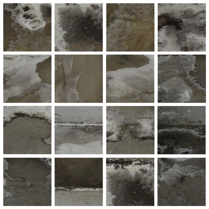 |
| Salt Stains |
Friday, February 18, 2011
Who Ever Knew
Who ever knew that sandpaper could be so gorgeous. Took these photos after doing the final sanding on the edges of my panels. About to pitch them in the garbage I finally "saw" them. Yummy butter yellow with soft white plaster and charcoal from the paint. The lines look scribbled and smudged and I like the straight lines and grid, actually they are covered with grids of the sanded off material by the time I throw them out.


Wednesday, February 16, 2011
The Shape of Wind
The wind picked up yesterday afternoon and the temperature dropped. You could barely see across the road for the snow whipping along in sheets. Even Zoe didn't want a long walk. It was bitter, but this morning the wind had worked her magic on the snow. I love the shapes of the drifts, the sharp upper edge, the way the light and shadow play with the forms. Even in the areas without the drifts the wind has carved patterns like sand on a beach. It really is amazing.
 |
| Snow drifts and patterns |
Monday, February 14, 2011
Love
Happy Valentines Day or as it is known in our house as Ballantyne's Day. Found this wonderful quote by Rainer Maria Rilke, which I feel says it all. "For one human being to love another that is perhaps the most difficult of our tasks; the ultimate, the last test and proof; the work for which all other work is but preparation."
 |
| The Red Thread That Binds, mixed media , 2010 |
Saturday, February 12, 2011
Two Steps Forward, One Step Back
A few months ago I met a lovely man called James Lourie and as I was going through his website I found an essay called "Why I Paint". These clear and powerful words moved me to write to him and ask permission to use his words for a piece I was working on. As the work progressed it became obvious to me the form needed to be a book, and so I tried several of the print on demand services. I was not happy with the results, and with much grinding of the teeth I am trying several new approaches. [stay turned for further news or more grinding of teeth depending on results] Meanwhile I thought you might enjoy a slide show of how I had hoped "Why I Paint" would look. You may recognize a very strong resemblance to a post last fall, and you would be right. This is where the photos of "Shades of White" led me.
Feb 28.11 have realized that some browsers do not like the slide show that I embedded below, so will try just adding a link to the album of photos of the book. Feedback would be gratefully received as I have a lot to lean about how different things work on Blogger, thanks.
Why I Paint link
Feb 28.11 have realized that some browsers do not like the slide show that I embedded below, so will try just adding a link to the album of photos of the book. Feedback would be gratefully received as I have a lot to lean about how different things work on Blogger, thanks.
 |
| Why I Paint |
Thursday, February 10, 2011
A Letter a Week
I never realized when I started this blog how many interesting, creative and fun people I would be meeting. In the maze of the Internet where one link leads to another, I find myself in unexpected places. Serendipity plays its part and so does synchronicity. A link took me to A letter A Week, but being very literal at times I took this to mean one had to write a letter a week. As my friends will attest I am one of the worlds worst letter writers. The few I have written are framed. Looking more carefully at the blog I realized this was about creating one letter from the alphabet every week. Ahh, this I like! Creating my own type had been a dream and now was the time. This one is based in my handwriting and the next one I think will be cut out of tin, or if I get really carried away, steel. Each letter will be able to stand on its' own, a continuation of She. Meanwhile I need to decide if I want the letters in this black and white alphabet to end up a long phrase that I will fold into an accordion book or do I put them in a grid. Any suggestions would be welcome.
 |
| a, b, c, d grid |
Tuesday, February 8, 2011
I'd Rather Be At The Beach
A thoroughly rotten day, weather wise that is. It snowed a bit and blew a lot, so that the outside world came in a out of focus. The snow packs completely differently when it's wind blown [it really is called hard packed for a reason] and J. and I are losing enthusiasm for that particular job and beginning to dream of warm sand and warm blue water. So while I was dreaming I came across this wonderful calligrapher called Andrew van der Merwe who also carves words and signs and symbols into the sand. His web site is here, you really want to see his work. As Andrew says "The work is usually very temporal, often lasting no more than an hour before it is taken by the wind or the tide. I carve the letters in the sand using various instruments and then photograph them . I leave no footprints and the tide leaves me with a clean slate. Most of the forms used here draw their inspiration from African writing systems. As a calligrapher I have a particular interest in African colonial and pre-colonial writing systems, so when I doodle on the beach its often along these lines. The more angular letter styles take their inspiration from Tifinagh, the script of the Tuareg people of North Africa. It is interesting how that, even to this day, the Tifinagh resembles ancient Greek and Phoenician."
 |
| "signatures" - a poem to all those illiterate men and women who signed their beautiful, simple lives away with a simple cross. The strange letters are shoes for the literate to stand it. |
 |
| This piece was carved on Zeebrugge beach, Belgium, in July 2008 during a month-long performance there. I was trying to create the impression of an ancient message from the ocean. The letters are loosely based on those of ancient writing systems |
Sunday, February 6, 2011
I Need More Green
Yesterday was a taste of spring. The road was dry, the sun had enough strength to warm your back as we walked and I began to remember what the earth smells like. I wake up earlier, dawn starts her appearance about 6 am and I am eager to start my gardening year ritual; the early walk around the garden with a big mug of coffee and a cigarette. I am longing for green, for growth, so that is why I put together photos of one of my favorite flowers, Queen Anne's Lace. Some consider her a weed, I think she is a beauty. The structure of her flower heads, the pattern of her leaves, the texture of the seed pods and did I mention she has a soft, honey fragrance; what is not to love.
P.S. Spoke to soon, we had another foot of snow last night. More than the Great Blizzard but my path is getting there.
 |
| Queen Anne's Lace |
Friday, February 4, 2011
My Richard Serra Path
The great blizzard wasn't. Well we got snow but nothing really to brag about. I was hoping for more but you have to be quiet about these kind of wishes because a lot of friends have had it with winter. I wanted more so that the front path could become my "Richard Serra" sculpture. If I shovel carefully, and we get enough snow, the curving path becomes similar to his work. [The path is top right.] The walls of snow of the path are as tall as me, so that walking it you are totally immersed in another world, and the shape, form and shadows are glorious. I need another foot of snow, meanwhile enjoy Serra's work.


Wednesday, February 2, 2011
Waiting For The Storm
For the 1st time that I can remember, Environment Canada, our weather station has called for a blizzard, and so in honor of this occasion it's time to introduce you to a wonderful and vibrant artist, Linda Zacks, who I discovered recently. She has the perfect way to celebrate this kind of weather: make a blizzard font. Check out her website; I really enjoy her work especially her books and her type.
 |
| Blizzard font by Linda Zacks |
Subscribe to:
Posts (Atom)