 |
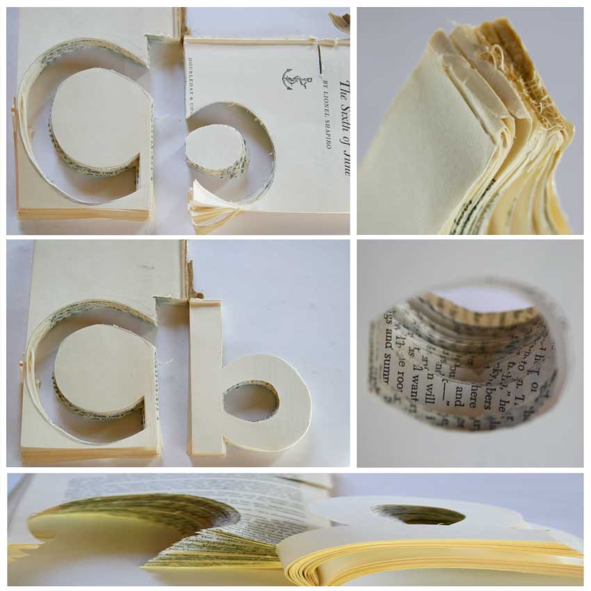
| Love the pages splayed open |
Monday, November 7, 2011
Notebook, Nov. 6.11
Letter B. The negative shapes are more interesting, except where the positive shape of the letter is bound. Love the pages splayed open, the play of the cut words. Check font used by BBC. Check that off the list, ugly, even if it is a square. DECIDE : upper or lower case, and stick with it. Why not both? Try frame around each letter and maybe lose the interior of the letters.
Subscribe to:
Post Comments (Atom)
Greetings from Finland. This blog is nice to explore, through other countries, people, culture and nature. Come and you look at pictures Teuvo blog and tell all your friends that they too would look Teuvo photos to your country's flag would rise higher than the blog my flag collection. Thank you Teuvo Vehkalahti Finland
ReplyDeleteThis looks really really good, Liz!
ReplyDeleteThanks for sharing.
best, Ralf
Very impressive!
ReplyDeleteThanks Teuvo for dropping by. I will be sure to come and visit you.
ReplyDeleteThanks Ralf, I think the letters are still looking for their form, so I will keep exploring.
Thanks Jo, I 've started! Now on to the rest.
Wecome Prasetyo, Thanks for dropping by and I will be sure to visit your blog
nice close ups!
ReplyDeleteThanks so much Velma
ReplyDelete